
As a Learning Experience Designer (LXD) at FourthRev I worked on multiple data analytics courses.
For one course I created an operational dashboard, using Tableau Public to build and deliver the dashboard.
The brief
- Assist a customer service team to book customer flights with the lowest chance of delays
- The team needs to compare all flight options for a selected destination, inclluding surrounding areas
- Develop a proof of concept dashboard using data for flights departing from Atlanta airport in 2015
Tips
- You can view the dashboard in full screen using the icon at the bottom RHS under the bar charts:

- if the dashboard embedded here does not display correctly on your device, go to Tableau Public
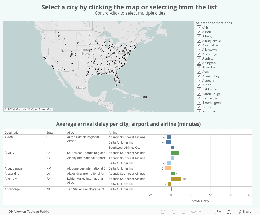
Dashboard features:
- designed for desktop computers
- allows users to compare the options for flights to each airport at the destination, along with the average arrival delays
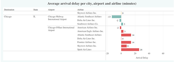
- horizontal bar charts are easy to understand: the longer the bar, the larger the delay
- width of the arrival delay axis is fixed so that the scale doesn't resize depending on the filters
- colour is not used to visualise numbers, but rather to visually group data from the same airport
- map can be used to include areas surrounding the destination
- menu-based alternative enables filtering by one or more cities and is accessible for vision-impaired users
- all non-text content has a textual equivalent
- the colour palette used is Tableau’s Colorblind palette